Game of Thrones map intro sequence is spectacular, and the lazy old “Google map screenshot” on client sites is getting pretty cliched and ubiquitous. So I thought, why not try some faux tilt-shift and basic colour manipulation to do something a bit different with those tired old maps?
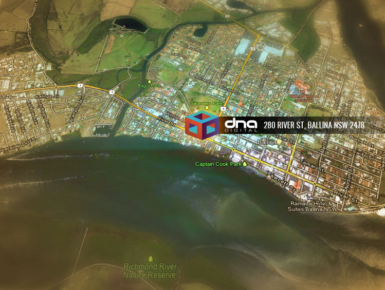
Here’s an example of what we’ll be making. Fortunately for this tutorial, our office is actually on Ballina’s river mouth to the ocean, just like King’s Landing!
Ok let’s go…
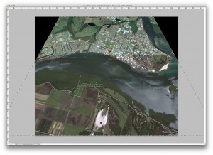
Step 1. Take a nice wide screenshot with your focal point in the middle. We’ll be cropping in pretty severely later so go a fair bit wider than you would normally.
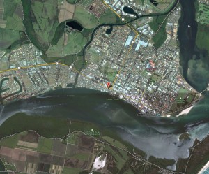
Step 2. Open it in Photoshop. Select all (Command-A) and go to Edit ->; Transform ->; Perspective. Use the handles to squeeze the top and widen the bottom. Now it looks like we are flying over Kings Landing! Crop your document in now so you can’t see the background that get’s revealed at this step.
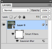
Step 3. We need to convert the map layer to work with Smart Filters, so go to the Filter Menu and Select “Convert For Smart Filters”.
Step 4. Go back to the Filter Menu and go to Blur ->; Gaussian Blur and make it fuzzier than a Hendrix after party.
Step 5. Click on the “Smart Filters” Layer Mask which is now under your map layer. It looks like a white box.
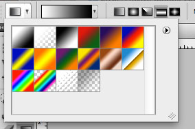
Step 6. Select the gradient tool, choose basic black->;white for the type but set the gradient shape to cylinder.
Step 7. Use the gradient tool to draw in the layer mask from your central point (i.e. the office, or main place) to some distance away. In my example I dragged it diagonally to make it look we are flying over at an angle. You can go straight up-down as well. Now the top and bottom of your map should be blurry but your main place is in focus, like a short depth-of-field effect. Nifty!
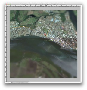
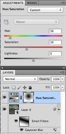
Step 8. Go to Layers ->; New Adjustment Layer ->; Hue/Saturation. I’ve added my settings in the screenshot here for the “golden” Game of Thrones style colour. (Hue 38, Saturation 39, Lightness 0, Colorize is ticked)
Step 9. Click in the Layer Mask for the Hue/Saturation Adjustment Layer and add a radial gradient by dragging from your main place as before. Make sure you select the Radial gradient tool first. This takes the colour effect OFF our main place and gentle fades it out. If you like you can add a second Adjustment Layer for Hue / Saturation below the other one and tweak the colour around your place. I just dragged the saturation up to strengthen Google’s normal dull colours in this example.
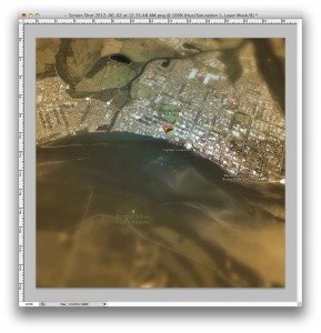
Step 10. Finally, add your place icon. There are plenty of nice “3D” style icons which will work here, but I chose to use our logo and then added our address. Feel free to add dragons as required.
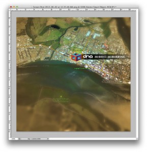
That’s it! Pretty spiffy huh? It helps if you have an office on that isn’t too far from the ocean for dramatic effect, like we have. Of course, I live in constant fear of attack via the seas from my competitors, but when the day comes I shall rain fire down upon them and their ships.
Did you like this tutorial? Send me a raven and let me know what you think!
1 Comment.
Classic. As a GoT tragic – I just love this. 🙂